Times have changed but banking hasn’t. The way we manage our money desperately needs an update. We need to make the world of finance simpler, smarter, and fit for modern life. It’s time to say goodbye to the old. And say hello to Hay.
What we delivered
- brand identity
- campaign design
- copywriting
- motion design
- naming
- verbal identity
In 2019, we were approached to name and brand Australia’s newest neobank. Working with the strategic brand positioning developed by the internal team, Hay said hello in 2020.
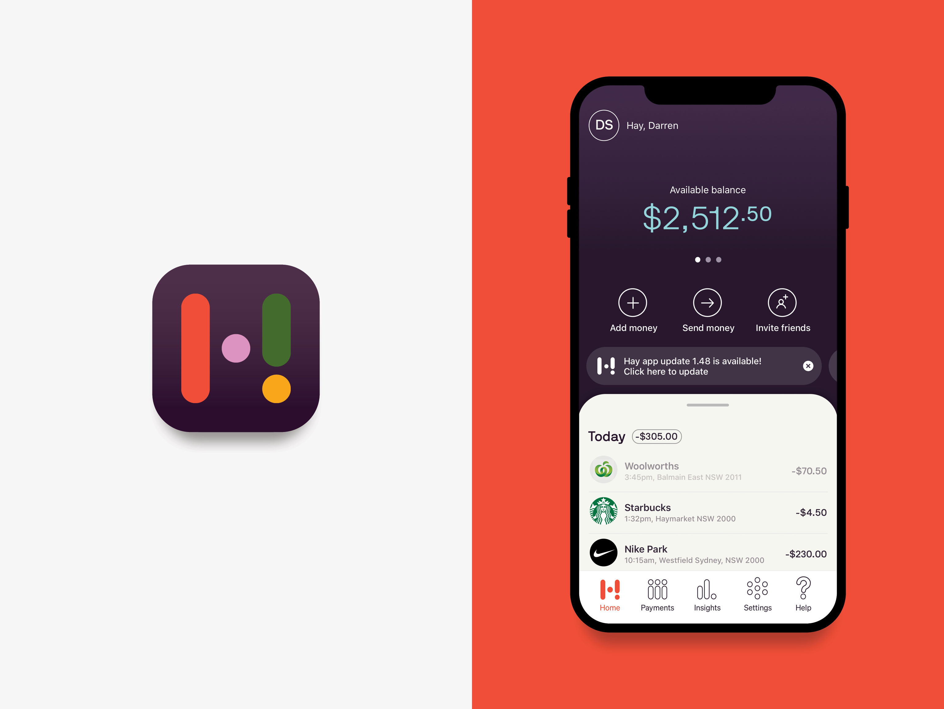
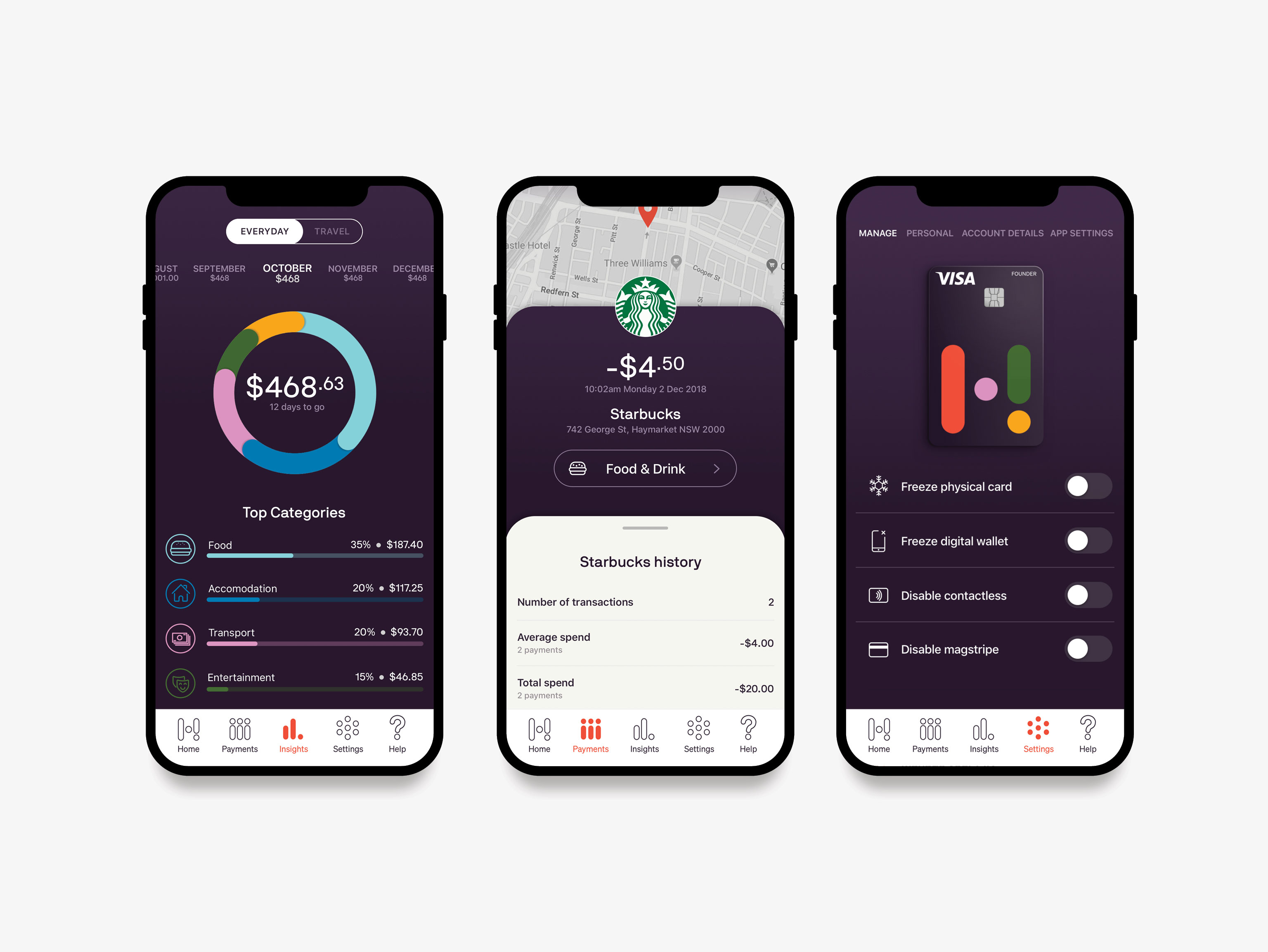
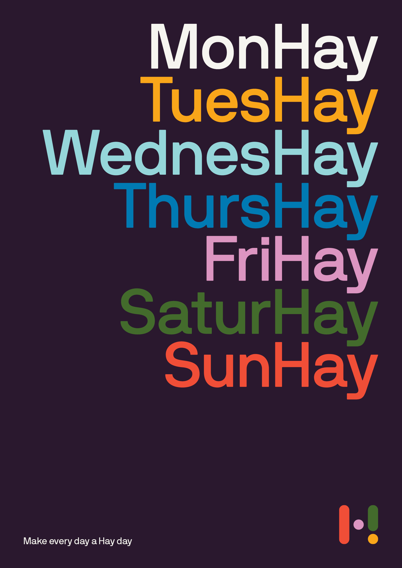
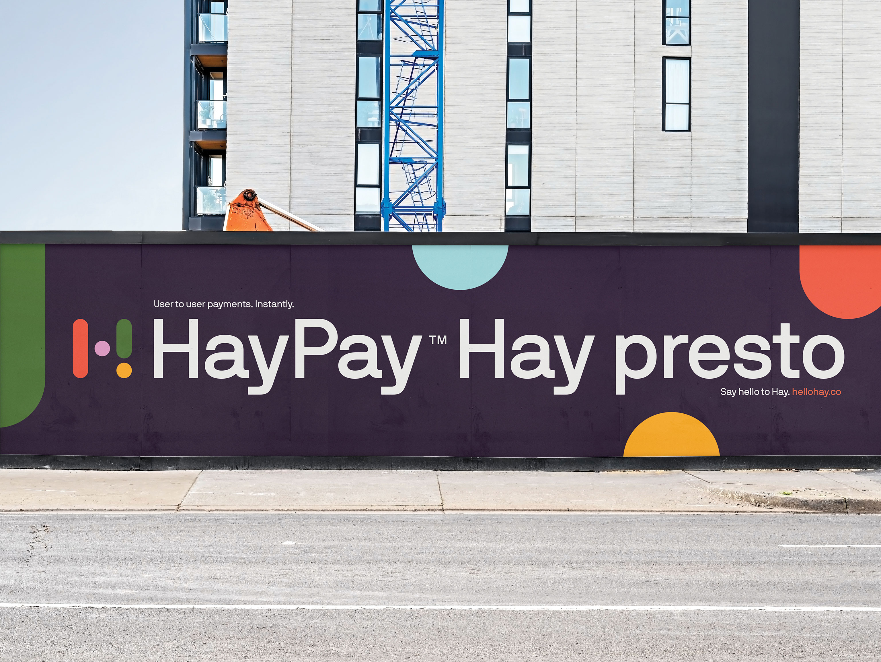
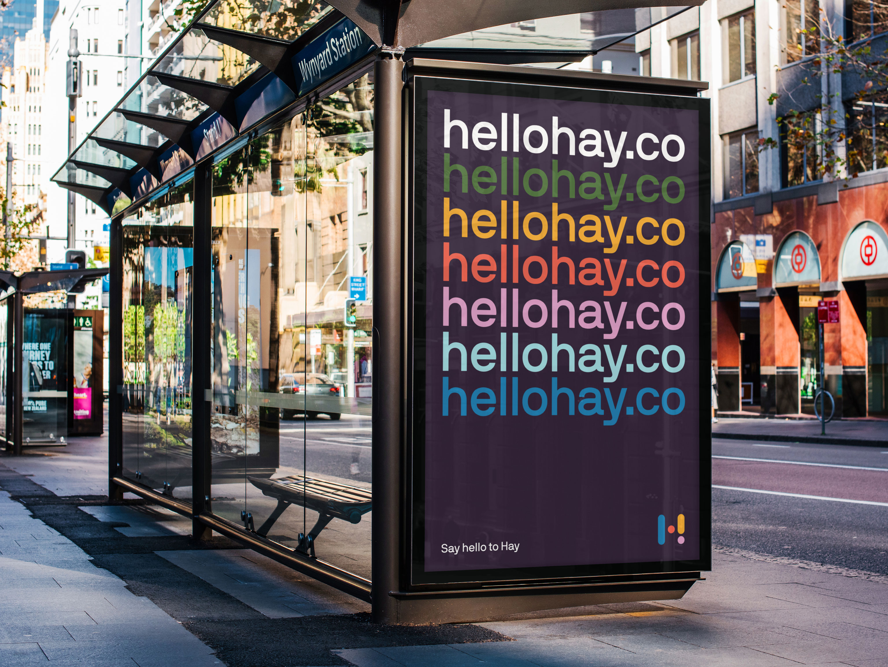
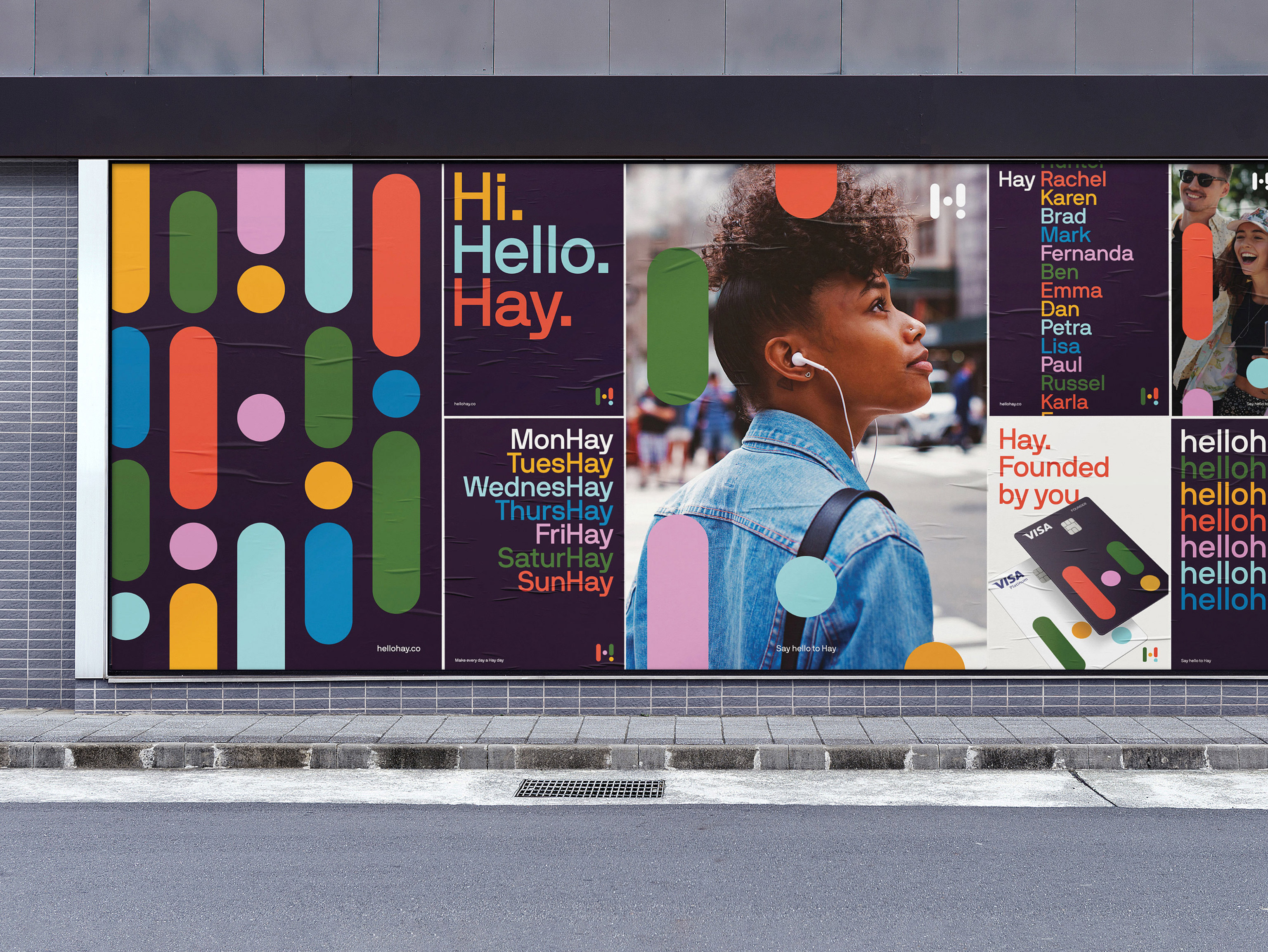
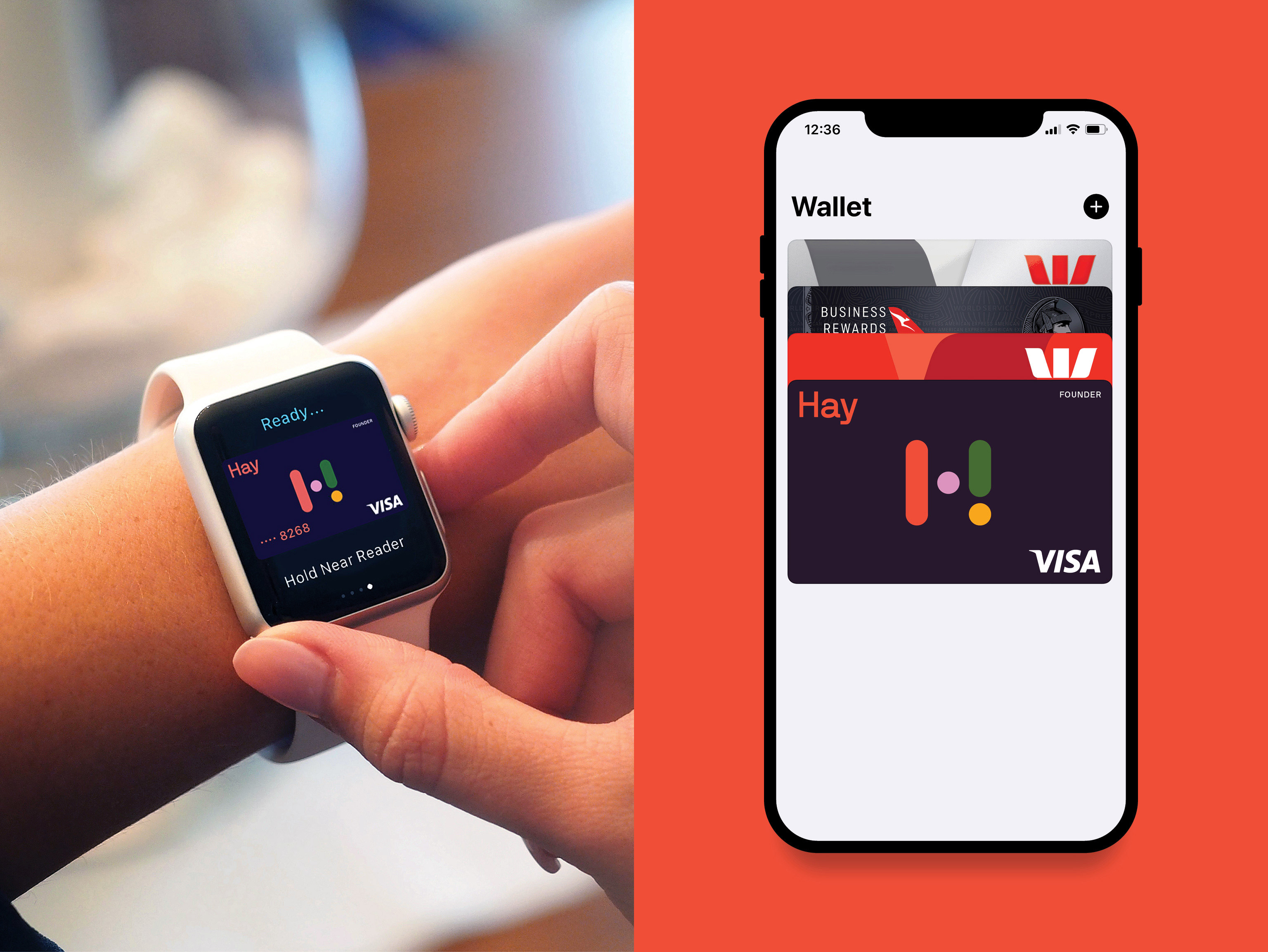
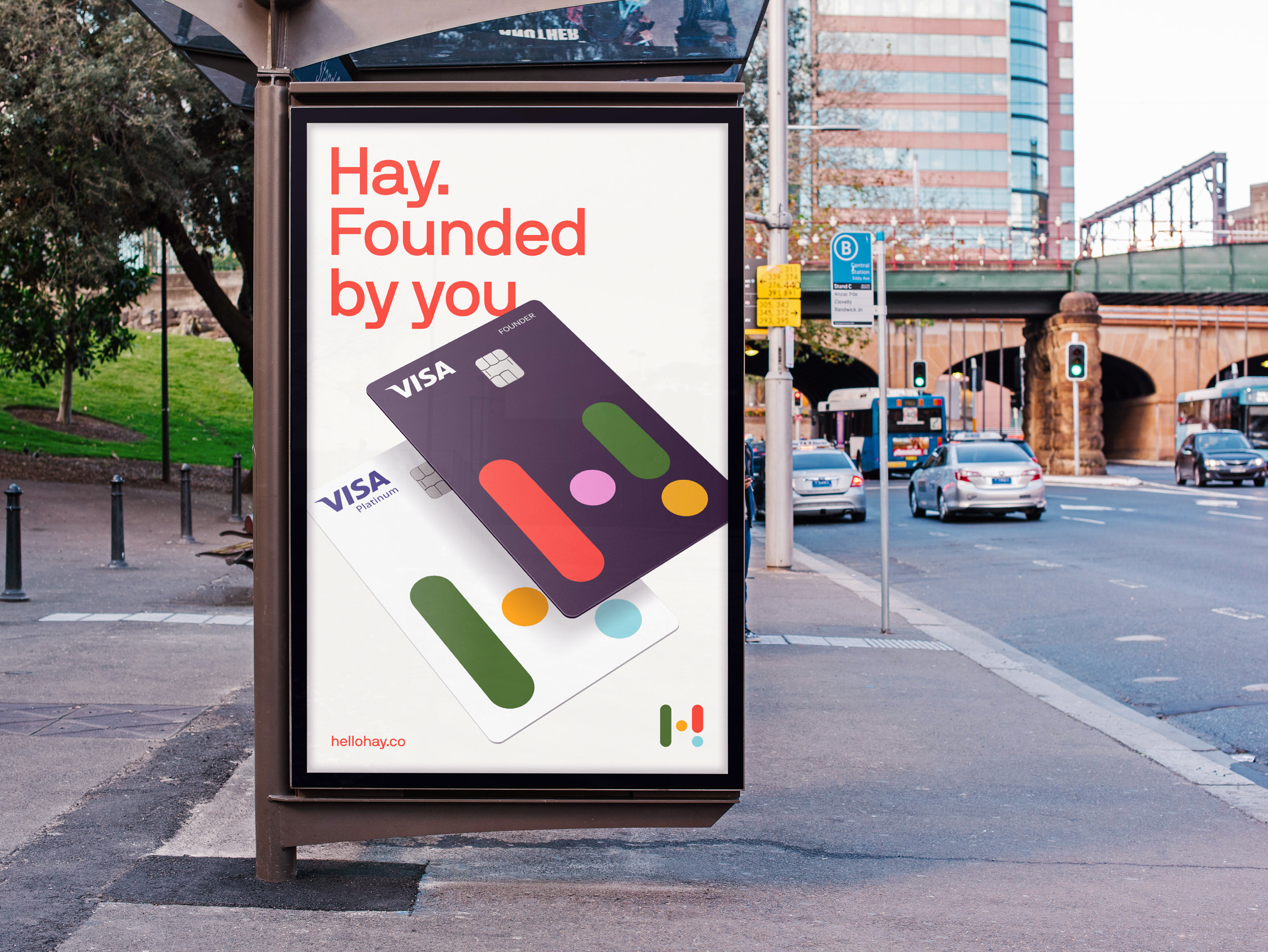
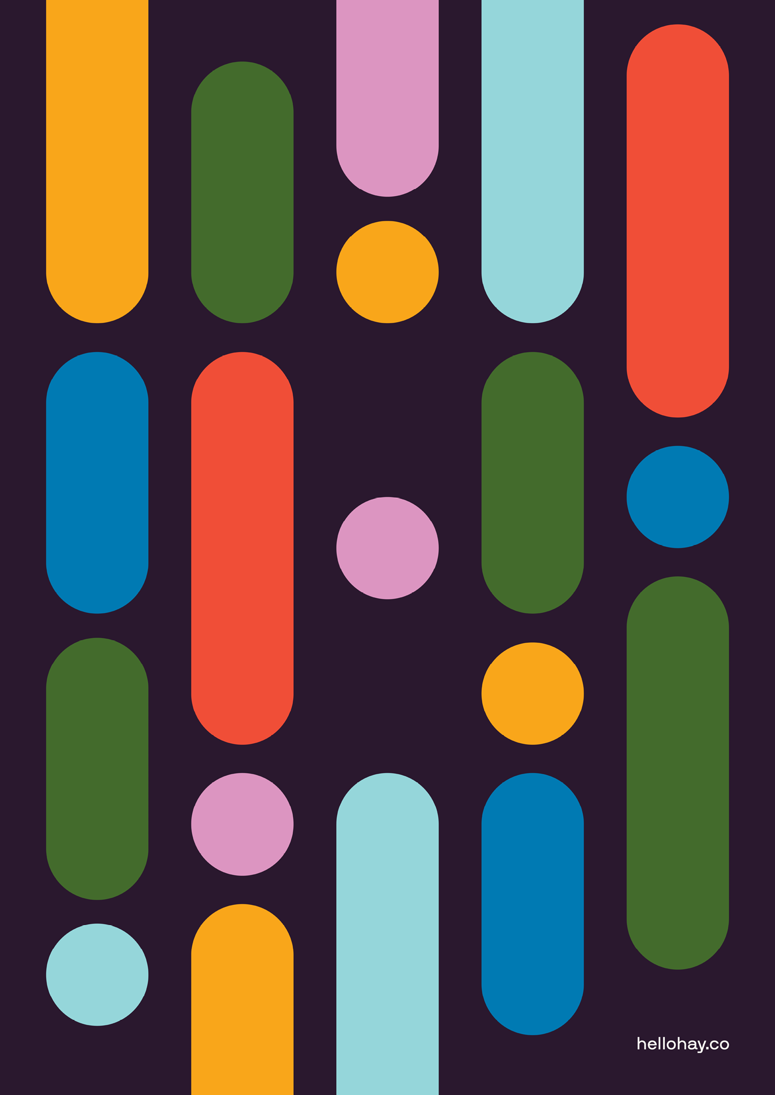
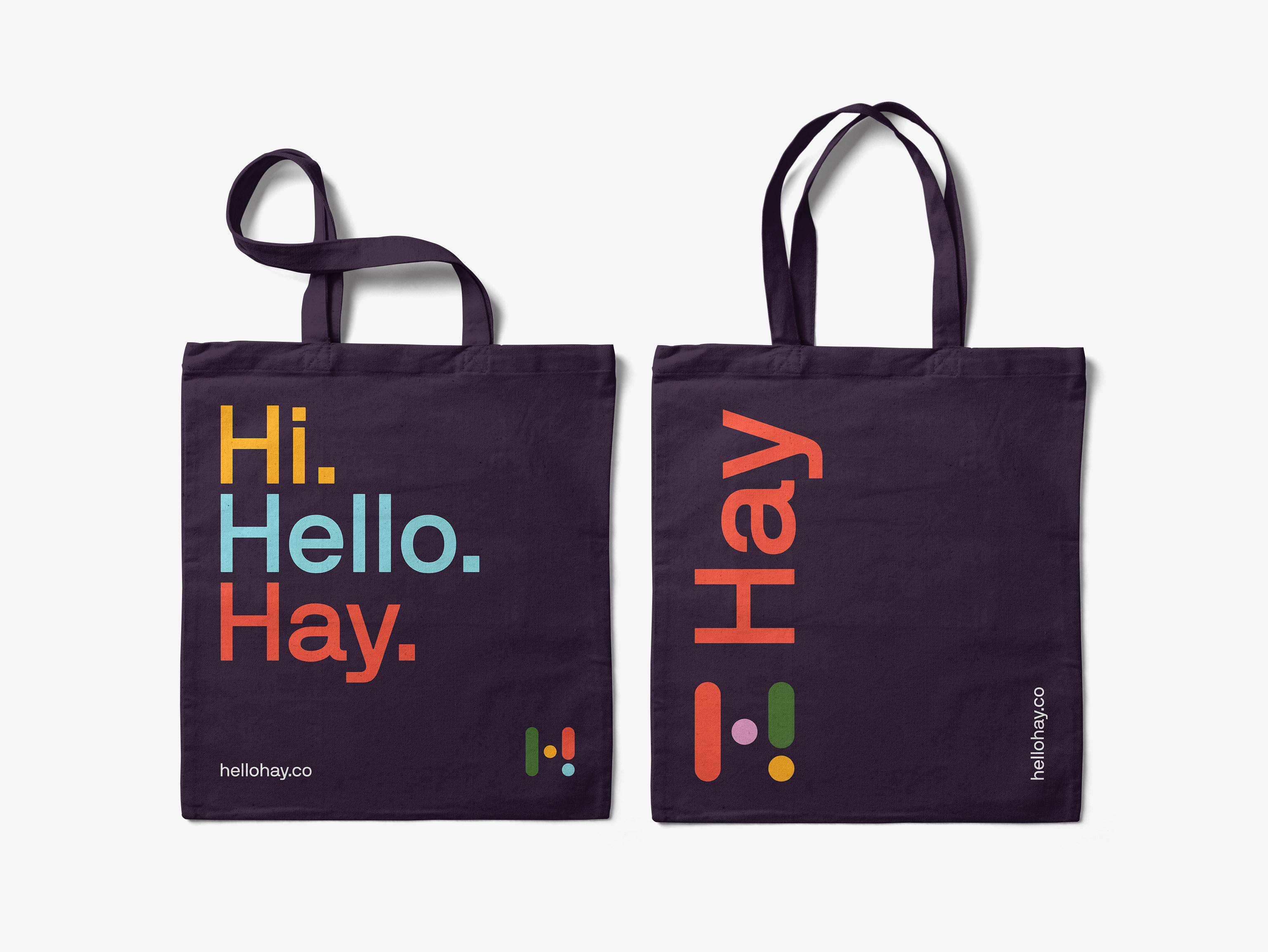
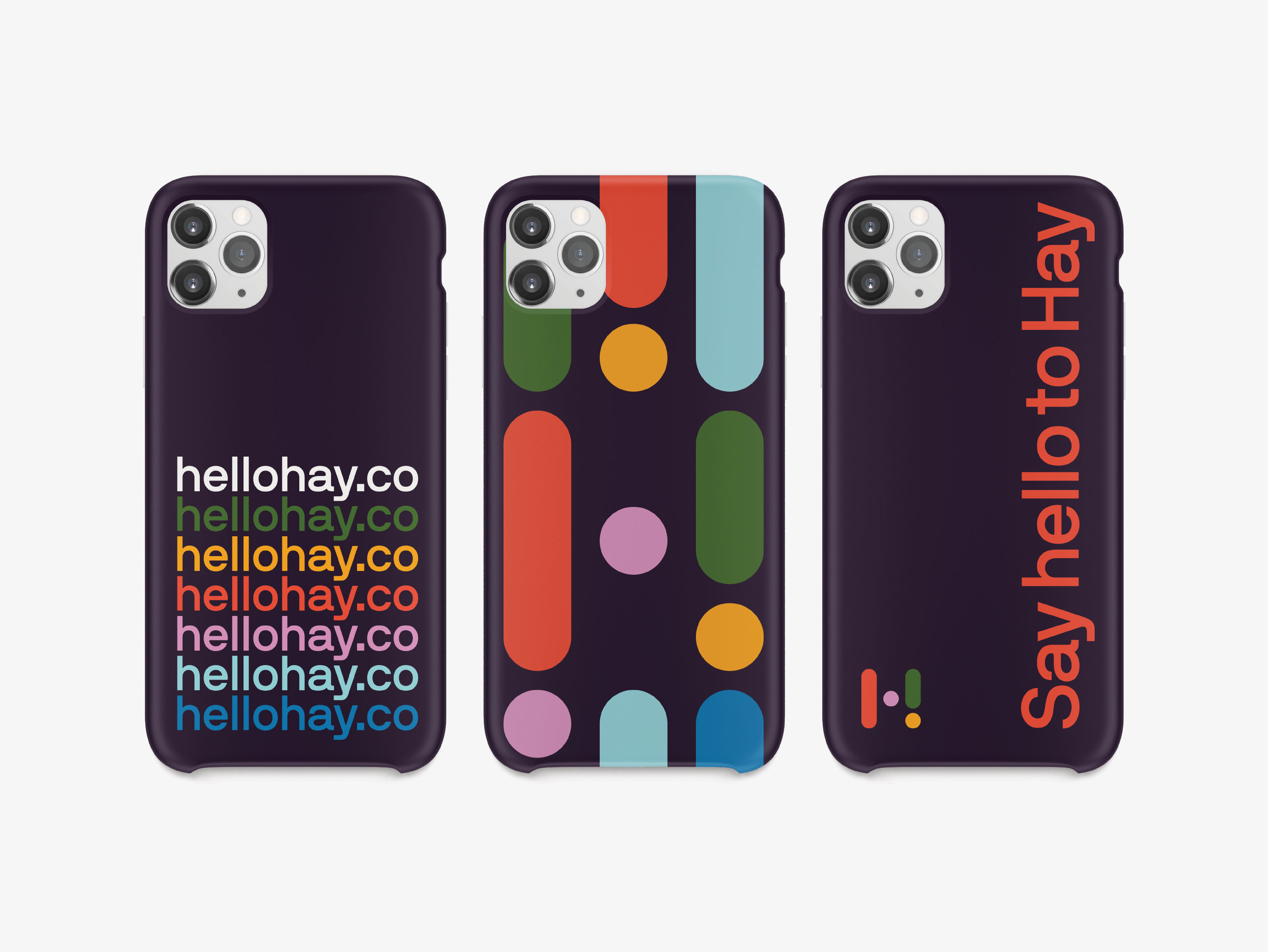
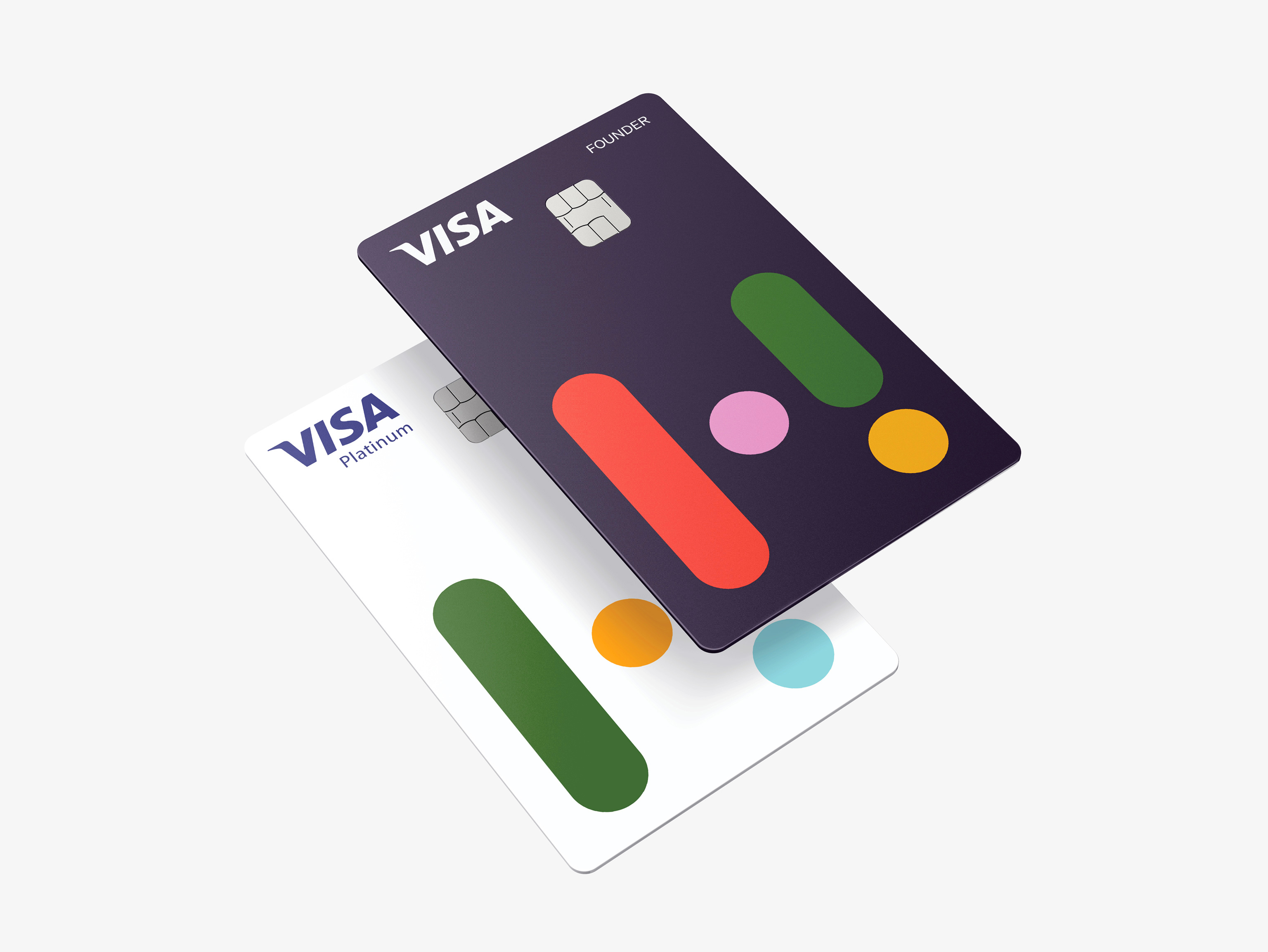
Hay is the newest addition in an industry disrupting the finance and banking world, helping Australians to rethink the way they manage their money. At the centre of the identity is a simple, colourful logomark that incorporates an exclamation mark, nodding to the energy of the name and the brand’s attitude. We also developed a comprehensive visual, verbal and motion identity system that reveals itself through simple touches of movement that capture the energy and enthusiasm Hay brings to the market.
The result is a bold, unique visual and verbal identity that flexes across their app, merchandise, national campaigns and in the hands of their users every day.
—
Verbal identity by Lex Courts.
Logo animation by Never Sit Still.