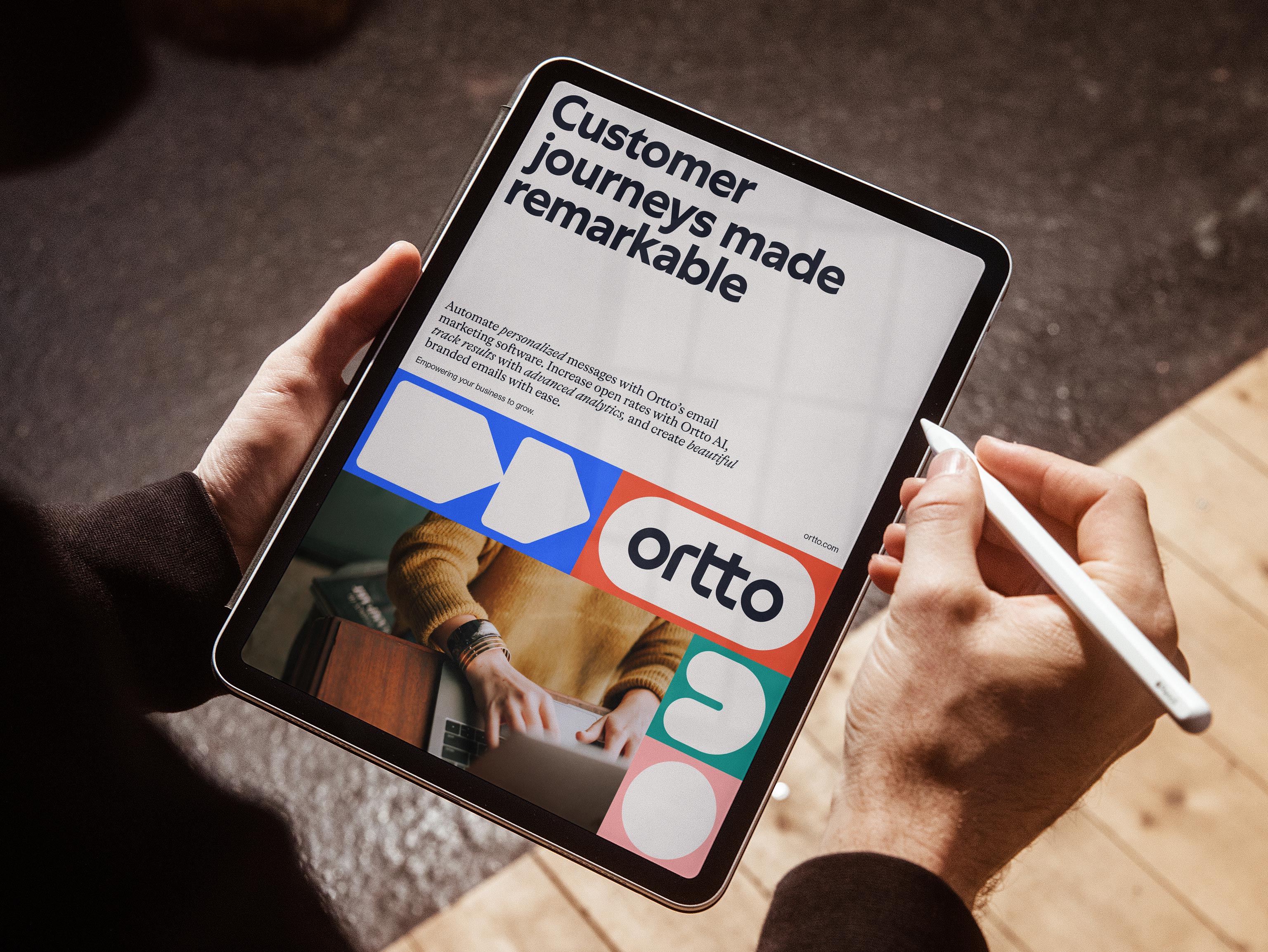
Ortto (formerly Autopilot) is a leading marketing automation solution. Having launched the first visual customer journey builder in the market, Ortto empowers businesses to unify their marketing process, segment their audiences, and harness powerful analytics. As the product and company have continued to grow, so has their need to unify and elevate their brand identity.
What we delivered
- brand identity
- copywriting
- illustration
- naming
- motion
- tone of voice
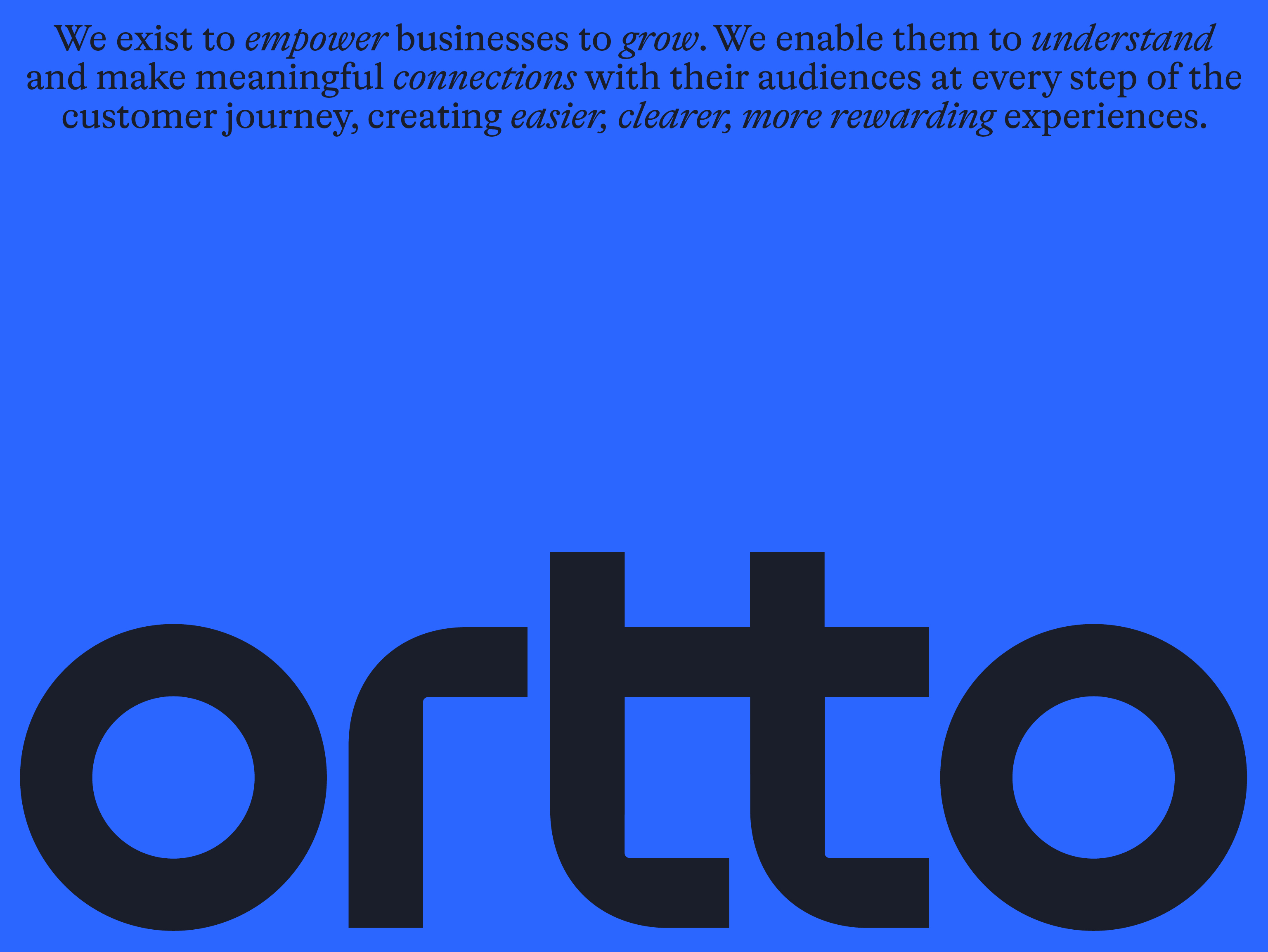
We were engaged to rename and rebrand Autopilot to strengthen their global presence and create greater distinction in the market. ‘Ortto’, based on the phonetic pronunciation of ‘auto’, references the company’s original name and key product feature of automation, but also allows the business to expand and evolve their offer.
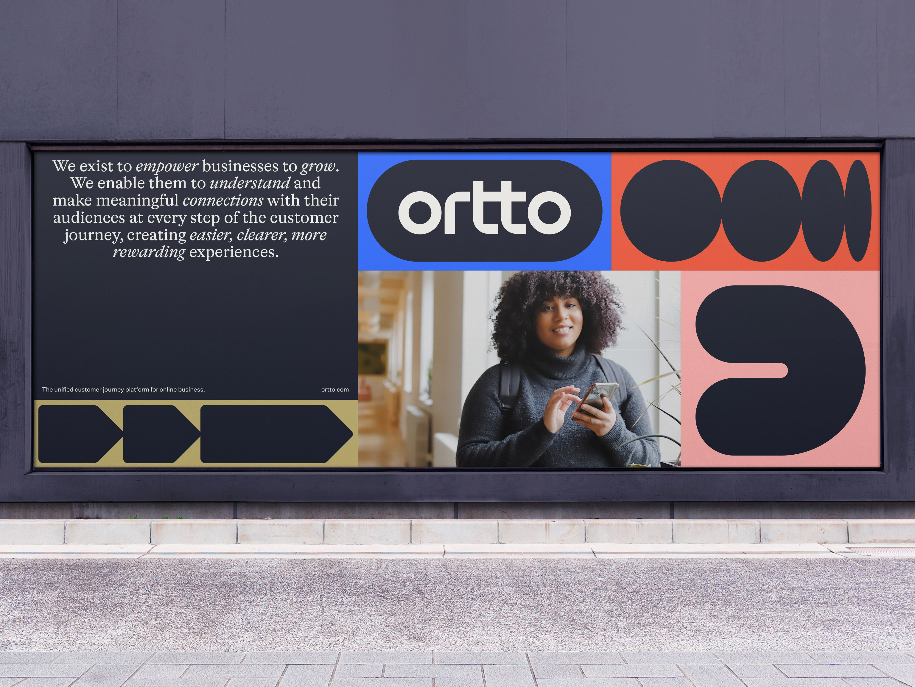
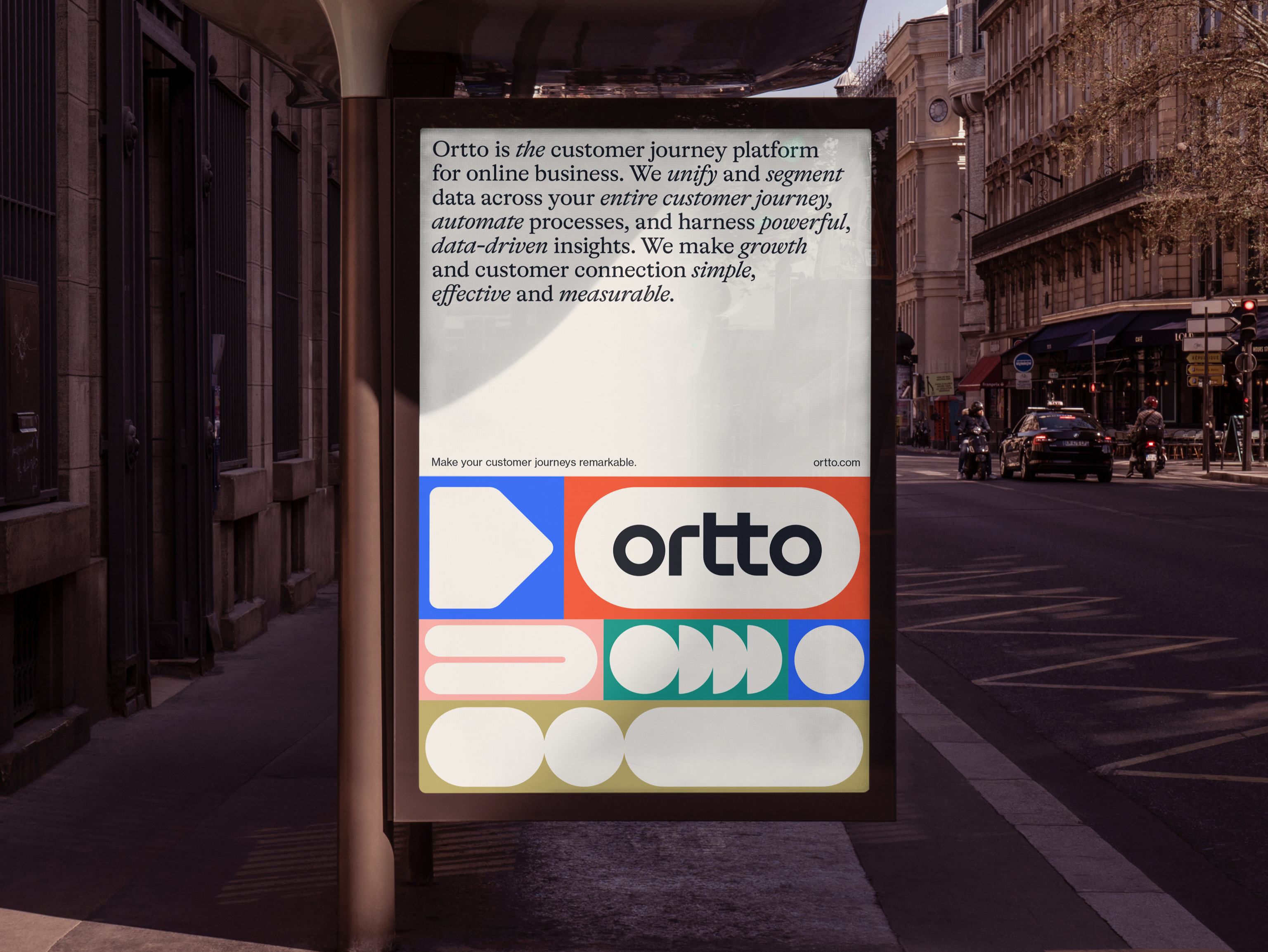
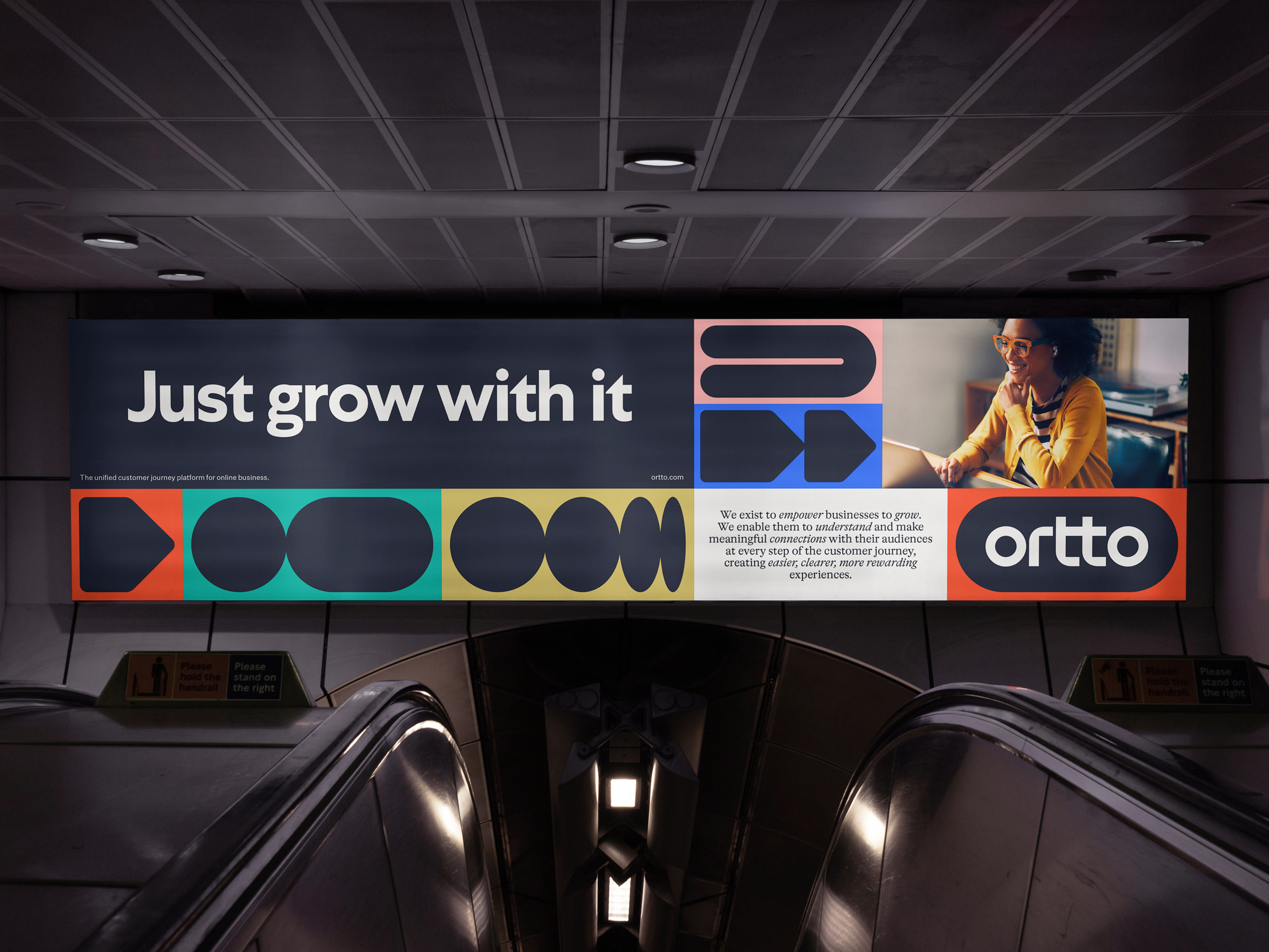
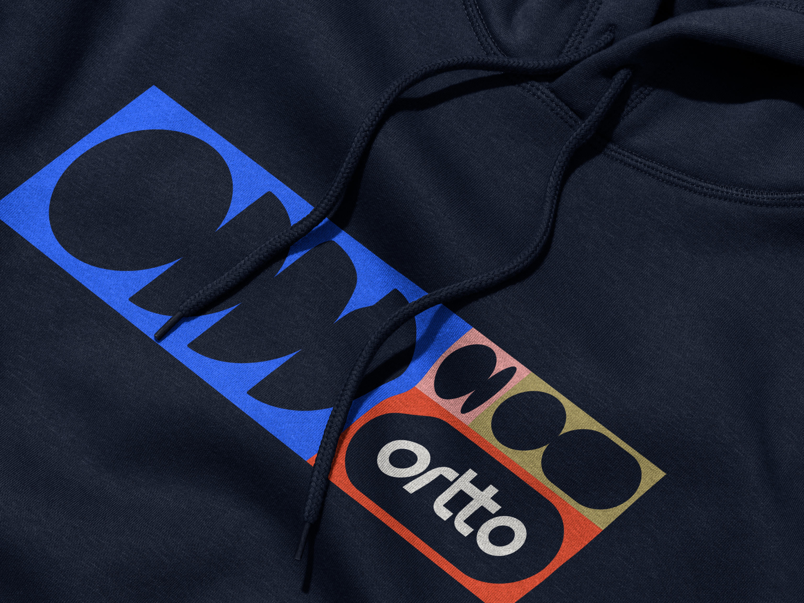
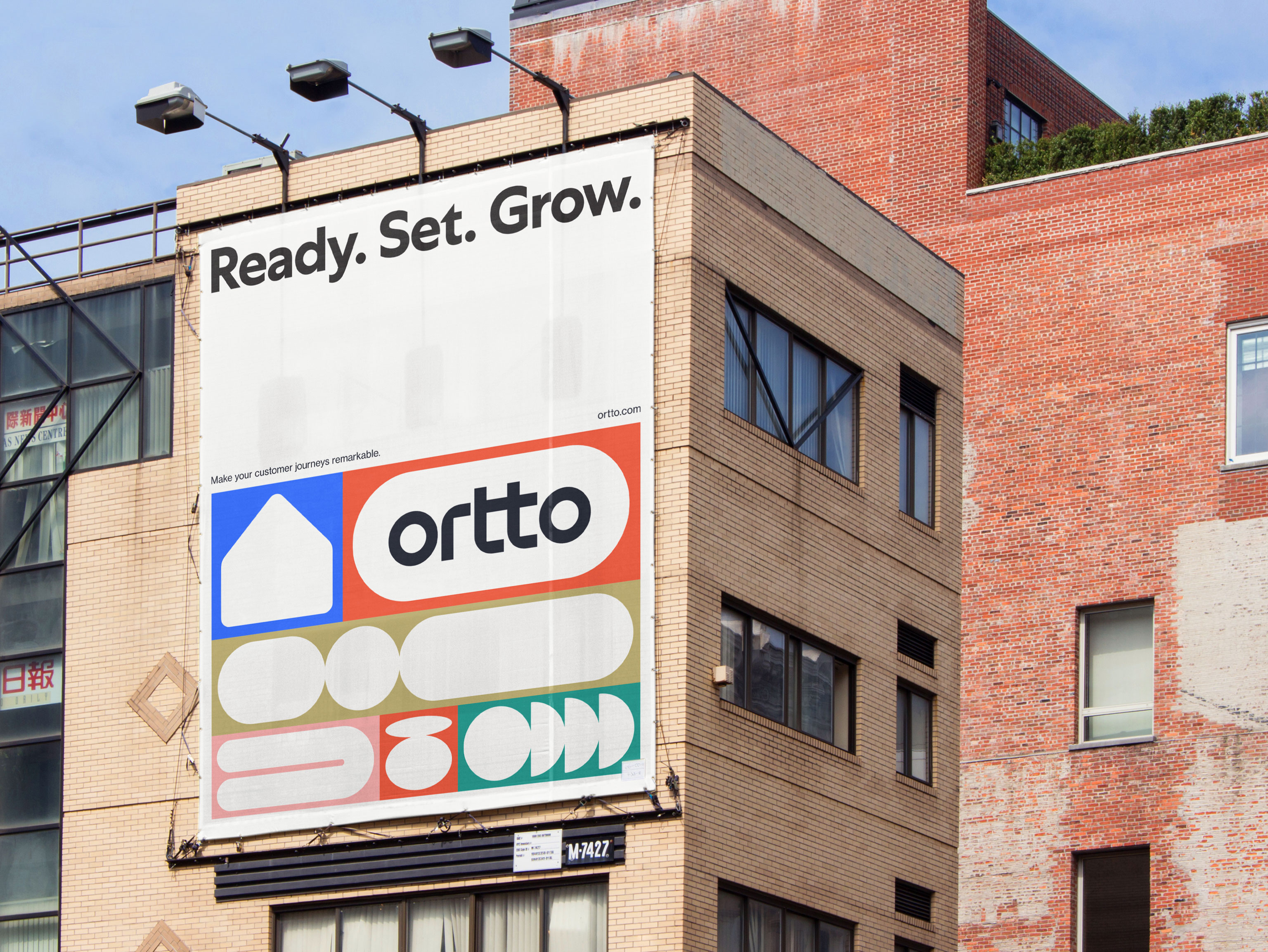
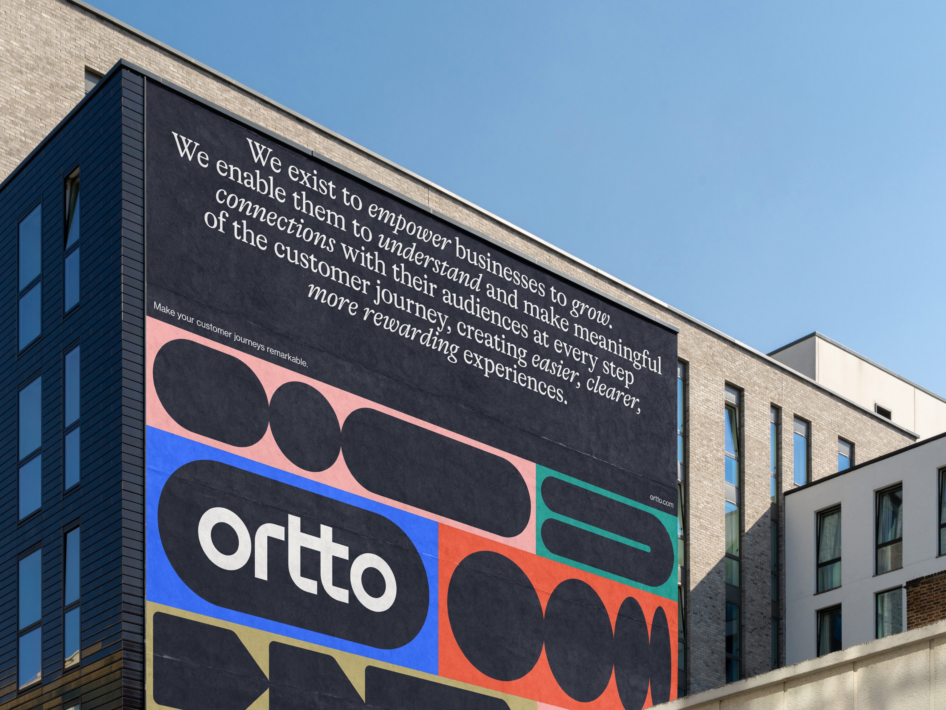
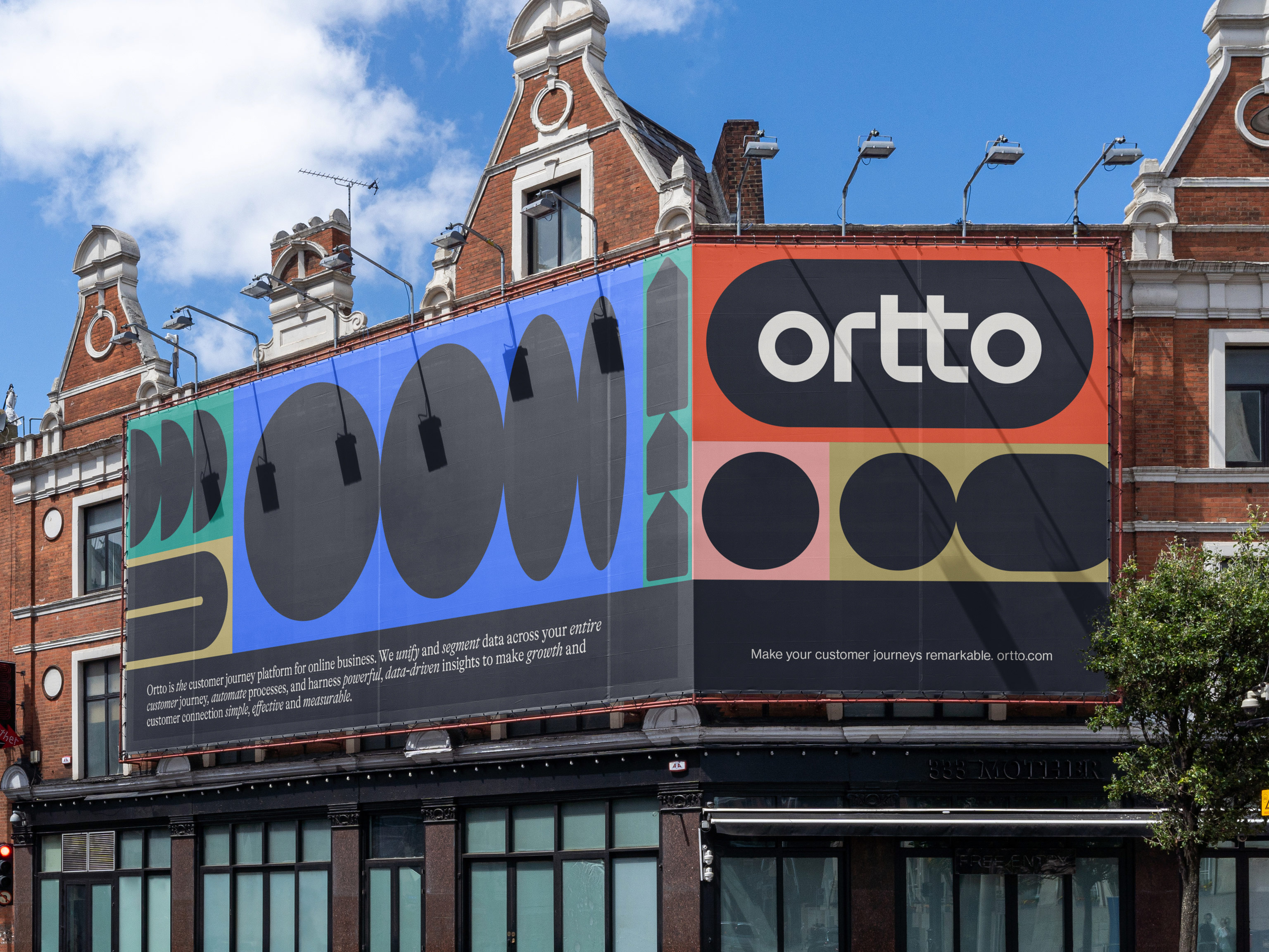
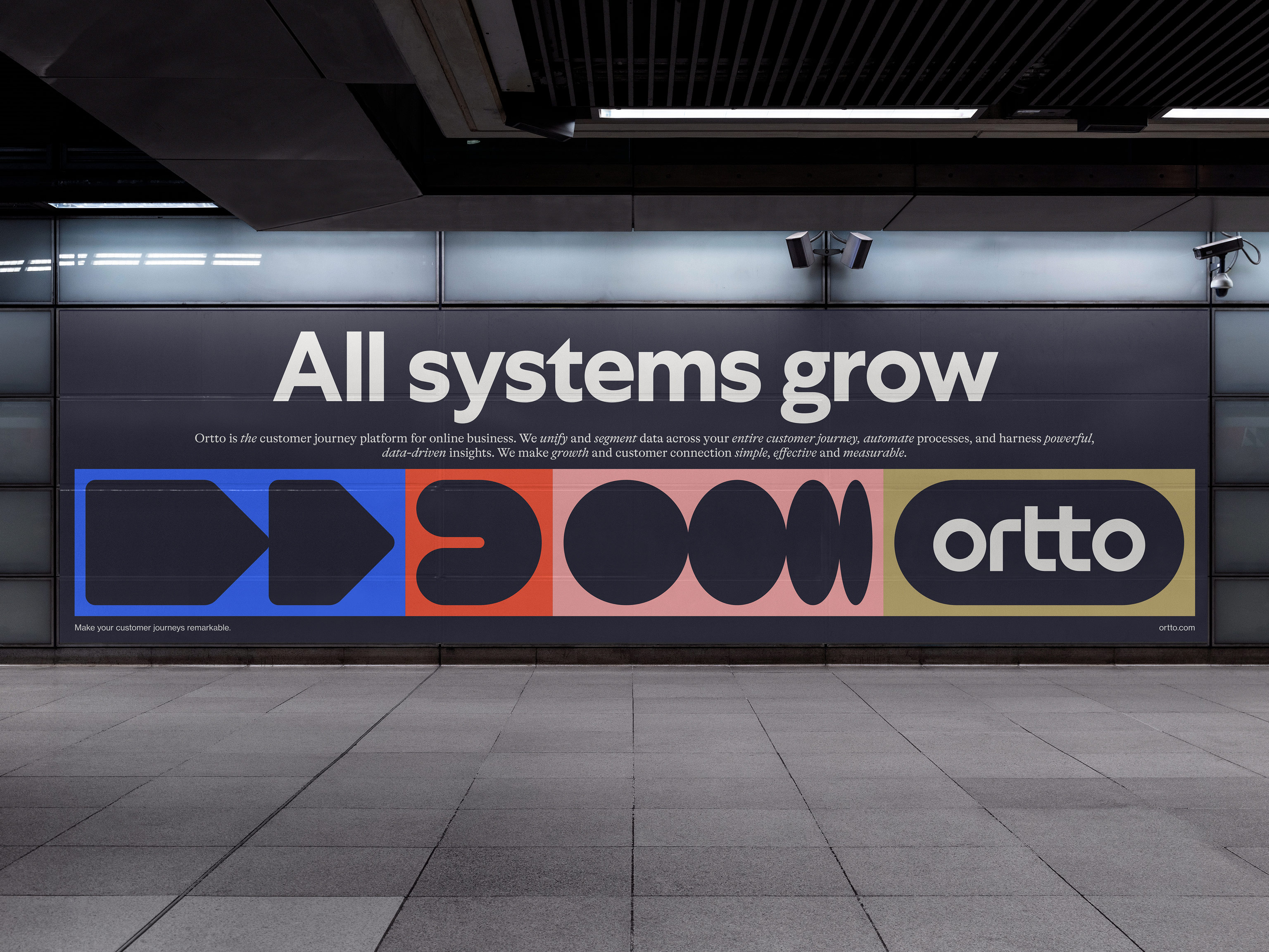
We developed a custom, scalable logotype built on the common geometry and linked letters found within the name. Referencing Ortto’s customer journey builder and the idea of connection, the brand system is a collection of bold and kinetic shapes, each with multiple variations. The shapes can be connected, customised, and coloured in endless combinations to build a variety of unique journeys.
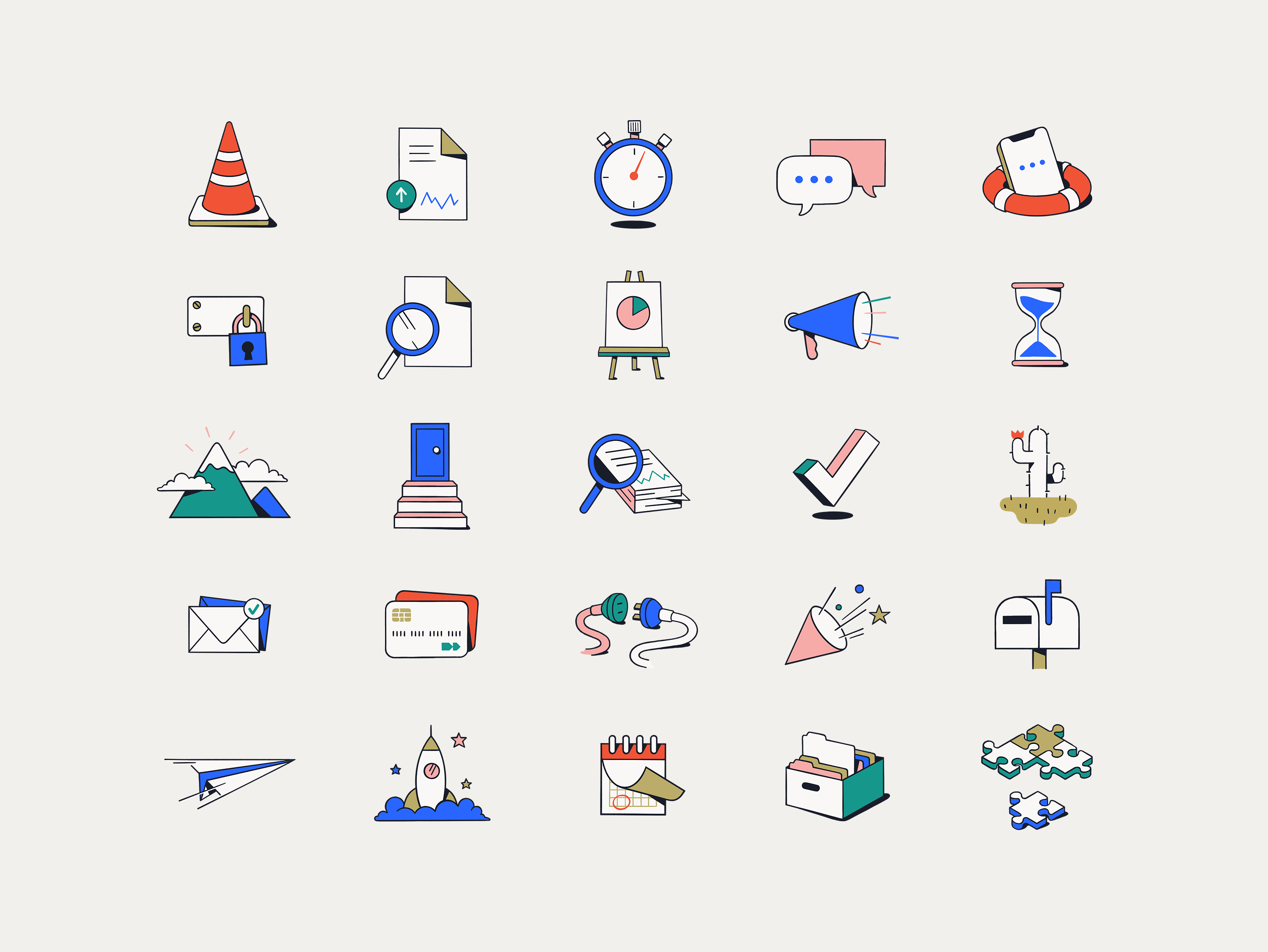
A vibrant and energetic colour palette was created to ensure increased UI functionality, and provide distinction and cut-through in marketing. The palette also informed a suite of in-app illustrations that help communicate the different stages of the product journey.
The whole identity is then brought to life in motion with looping shape and logo animations, creating a flexible, modular, always-moving brand system.
—
Tone of voice by Cat Wall.
Illustration by Dave Coleman.
Logotype refinement by Dave Foster.
